 What girl doesn't love this little turquoise box?
Who inspired who? The color for the Tiffany box and the Florence Broadhurst wallpaper look almost identical. I have recently been reading the book: FlorenceBroahurst - Her Secret & Extraordinary Lives. She has quite a few designs in turquoise for her wallpapers that were designed in the 60's & 70's. I like that this color is once again fashionable and is being used in interiors.
Refreshing and Sophisticated: A mix of blue and green, turquoise has a sweet feminine feel while the darker teal shades add lively sophistication. Some shades of turquoise have an old-fashioned 50s and 60s retro feel. Turquoise has the same calming effects as the mixture blue and green it is comprised of .
Culture of Turquoise: This in-between color represents water, thus the names aqua and aquamarine. It's also a valuable and popular mineral often turned into jewelry. Turquoise is closely associated with the Middle East and the American Southwest.


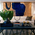
 Burnham Design via Desire to Inspire
 I like the effective use of painted stripes flowing from the wall across the ceiling.
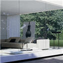
 John Stefanidis
 Francis Elkins Chair via StyleCourt


I think that shots of turquoise in a room is similar, in a way, to having pops of red- both give energy and vibrancy to a room. I love that photo from Domino.
ReplyDeleteAaahhh! One of my very favorite colors! And you have captured it in some very nice images!
ReplyDeleteYes, ditto the comments above. I love this.
ReplyDeleteI love all these shades of blue. What a marvellous colour, and my overall favorite since age 4. :)
ReplyDeleteAs an amateur decorator, I struggle with blues, figuring out which I like best(impossible), how to mix them (difficult). They are really all distinctly different colours, aren't they! I tend to stick with the blue-grey family but that gets boring as I also like the sky blues and aquas and even indigos. I would like to do some indigo/denim with a coppery-orange duvet cover I bought from StGeneve. Then again, I am drawn to the more peaceful blues...
I'm also finding it hard to buy nice blue fabric in Calgary. Chintz & Co had almost nothing in solid pale blue! Is it hard to find blue drapery fabric in Vancouver? I may need to make a trip. ;)
Love this colour too! (The photo of unknown source is by Betsy Burnham)
ReplyDeleteHi Kim...thanks for the Betsy Burnham notation.
ReplyDeleteHi Terry...your indigo/denim with coppery-orange color scheme sounds great. Thanks for your comment
Thanks StyleCourt & KatieDID
HI Peak of Chic... I also like the Domino photo. I think there is a very interesting mix of shapes,colors and patterns going on in this room. And I totally agree that pops of color give a room excitement and depth. Thanks for the comment.
What an inspiring post Patricia!! One of my favorite colors is so many lovely settings...and my favorite broadhurst wallpapers too :)
ReplyDelete~Kate
just hit a soft spot ... :)
ReplyDeletethat bedroom image by Burnham Design ... gorgeous! i'm looking for a rug like that - i could just melt in that rug!
great post!
Jenn
Hi GirlMeetsGlamour
ReplyDeleteI am glad these are you fav Broadhurst wallpapers..mine too.
Hi JLee
Doesn't that carpet make you want to curl your toes up in it? Hope you find one.
omg - are you trying to kill us with beauty? truly. The House Beautiful bedroom speaks to me totally. Like this post. Love it!!!
ReplyDeleteJoni
I forgot to add that the Domino picture is a personal favorite of that issue. Beautiful room.
ReplyDeleteJoni
I adore turquoise, esp in ceramics and pottery.
ReplyDeleteGreat post - one of my favorite colours!
ReplyDeleteJoni, Maryam & Suzy
ReplyDeleteThanks for all your wonderful comments. Since doing this post I am seeing Turquoise Everywhere!!
seems we both are infatuated with this color! it is one of my faves for sure.
ReplyDeletehttp://studiowellspring.blogspot.com/2007/06/robins-egg-bliss.html
Hi Studio Wellspring....yes I guess we are on the same wave length. I love how ideas and inspiration bounce around on our blogs. Thanks for your inspiration
ReplyDeleteI am just loving the use of turquoise more and more I see it in your blog, its just such a pity that I would have to redo everything in my home to incorporate the color in.
ReplyDelete