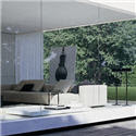


This is a penthouse project that I recently completed for a couple with two small children in downtown Vancouver. It has a fantastic view that was a little overwhelming when I started on the project. There was nothing to keep your focus inside the space. I decided that I needed to be bold in my choice of finishes. I grounded the space by adding teak panelling to the raised ceilings to mirror the teak of the floor. The furnishings & accessories were kept to a minimum to not detract from the view. The finishes had to child

friendly. The dining table and countertops are
Caesarstone, which is virtually indestructible. The dining room chairs were upholstered in white leatherette. I put studding on the chairs at the top of each leg. The chandelier was picked for its fun and whimsy. The sofa is real leather and the area carpet is wool from Belgium. The ottoman is upholstered in Cashmere, which isn't exactly child friendly but my client fell in love with it. The back wall of the cooktop is a wonderful piece of Granite that I hand picked from the supplier, and it was with much difficulty, that they were able to install it as a slab - in one piece with no seams. It weighed approx 600 pounds and had to be taken up to the top of the building. It looks fabulous, and hangs on the wall like a magnificent piece of artwork. I also

wanted to use warm coloring & natural products to connect the space with the earth energy. The color of the granite picks up the color of the teak and has these beautiful charcoal grey veins running through it. I matched the paint and carpet color to this gray veining in the granite to further accentuate the granite. The effect is better when you are in the space. You feel like you are on top of the world but at the same time the space is very warm and enveloping. The clients are happy with the end result and they are finding it very family friendly and good for their frequent entertaining.
Chandelier Dandelion MoooiGranite Bordingnon Marble & Granite
 This is a penthouse project that I recently completed for a couple with two small children in downtown Vancouver. It has a fantastic view that was a little overwhelming when I started on the project. There was nothing to keep your focus inside the space. I decided that I needed to be bold in my choice of finishes. I grounded the space by adding teak panelling to the raised ceilings to mirror the teak of the floor. The furnishings & accessories were kept to a minimum to not detract from the view. The finishes had to child
  friendly. The dining table and countertops are Caesarstone, which is virtually indestructible. The dining room chairs were upholstered in white leatherette. I put studding on the chairs at the top of each leg. The chandelier was picked for its fun and whimsy. The sofa is real leather and the area carpet is wool from Belgium. The ottoman is upholstered in Cashmere, which isn't exactly child friendly but my client fell in love with it. The back wall of the cooktop is a wonderful piece of Granite that I hand picked from the supplier, and it was with much difficulty, that they were able to install it as a slab - in one piece with no seams. It weighed approx 600 pounds and had to be taken up to the top of the building. It looks fabulous, and hangs on the wall like a magnificent piece of artwork. I also
  wanted to use warm coloring & natural products to connect the space with the earth energy. The color of the granite picks up the color of the teak and has these beautiful charcoal grey veins running through it. I matched the paint and carpet color to this gray veining in the granite to further accentuate the granite. The effect is better when you are in the space. You feel like you are on top of the world but at the same time the space is very warm and enveloping. The clients are happy with the end result and they are finding it very family friendly and good for their frequent entertaining.
Chandelier Dandelion Moooi


What an amazing penthouse! Oh and the views...stunning! I can see how it would be tricky to focus the attention inside, but it's lovely. And that chandelier - love it!!
ReplyDeleteCrazily beautiful and perfect.
ReplyDeleteGorgeous! I'm working on a project right now for a single mother with two boys and as much as I wanted to go white with the furnishings I was afraid because of the kids but you did a great job! It's clean and white but not overly white, especially with the ceilings matching the floor ... and great kitchen backsplash, is that wallpaper/tile??? Just stunning!
ReplyDeleteHi J Lee
ReplyDeleteThanks for your comment. The backsplash is a slab of granite.
Beautiful Patricia! I especially love the light fixture over the dining table. Wonderful!
ReplyDeleteYou can be proud of this project because in my book, you exceed your goal.
ReplyDeleteThe chandelier looks so great in this place. You need strong pieces like that to direct our eyes. MOOOi Design is a great source for conversation pieces.
Thank-you Katie & Kim for your compliments. I like to have fun with lighting fixtures. They are such an important element in the room.
ReplyDeleteI think it's a beautiful space. It feels very organic, simple, and elegant. Love the whole look. And, yes, the light fixture is wonderful.
ReplyDeleteSusan...thanks for you compliment
ReplyDeleteWow, I love it! Great blog, great inspiration!
ReplyDeleteGreat job Patricia! The whole space is beautiful. I particularly am crazy for the Granite behind the cooktop. I think that looks spectacular! No wonder that shot made the cover of the mag!
ReplyDeleteThanks Purple for your comment.
ReplyDeleteI am flattered because your blog is "fantastic'
Thanks Peak of Chic...the Granite slab is so magnificent. It was fun to choose it at the granite yard. They pulled out several slabs by forklift for me to look at before I found the perfect one. Then we did a template on the slab with masking tape so I got the veining in the exact spot I wanted it.
Absolutely incredibly gorgeous! The ceiling and the floor are genius - the ying and yang of contempory vs natural. stunning. I'm speechless. Well, not quite - I love the way you covered the refrigerator and - is that a pantry? - to match the countertops. The granite, again, nature vs. manmade. You should be very, very proud. I am - just to say I "know" you.
ReplyDeleteJoni
Hi Joni...thanks for your compliments. Yes that is a sub-zero refrigerator and pantries with pull out stainless steel shelves. The subzero is covered in white lacquer panels. Good noticing.
ReplyDeleteWow Patricia,
ReplyDeleteThat's all I can say. I love the colors you chose and hardwood used. Did you also replace the flooring? If so, what did you use? Do you think using a zebrano hardwood would work in such a space and colors?
Keep up the amazing work!
Marvelous, Patricia! I love that magnificent granite, and am particularly taken with the wood ceiling panels. It's wonderful how they not only warm but also ground the space, and both keep the eye inside as well as lead it out. That was sheer genius indeed.
ReplyDeleteAm I seeing narrow little drawers at the base of the island with those lines that look like the drawer separations on the main cabinet?
Wendy
Hi Wendy
ReplyDeleteThank-you for your compliment on my design. I think the picture is an optical illusion...the lines are the grains in the teak, as there are no lower drawers on the island.
Patricia
Very, very nicely done! I love the clean, fresh look with the white colored furniture and decor.
ReplyDeleteThe chandelier, nice touch of elegance there.
Great idea on keeping the furnishing and accessories to a minimum for the view.
Excellent work.