 David Hicks circa 1970's
I love the mirrored panel between the windows, and this bed was before pillow top mattresses and duvets. Talking about duvets my last two clients have done away with their duvets and requested a Bedspread with blankets.
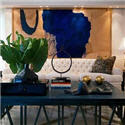
 Ruthie Summers circa 2007
Pink has been showing up everywhere for me lately. Dianna Vreeland was famous for her saying that "Pink is the navy blue of India". I don't know what decade that was, but I have never seen a resurgence of pink for interiors like this for the last several decades. Maybe the 80's was pink, but it was more of a dusty rose, not the clear pink we are seeing now. I love this new clear pink. It makes a great backdrop for dramatic furnishings. If you are a feeling a bit intrepid about using it in massive amounts, there a few pictures here that show it used for accessory items: artwork, cushions, chair upholstery even pink mirror. Think of pink as a happy, fun color.
 Ruthie Summers showroom in LA
fabric on the chair seats Lulu DK: Chant
 Ruthie Summers fabric Quadrille Lyford
 Mondrian Scottsdale Hotel designed by BNO Design
Notice the pink in this picture is actually pink tinted mirror  David Hicks textile design
  The above 2 photos are from the David Hicks Archive.
It reminds me of Dianna Vreeland's saying: "Pink is the navy blue of India"
Suzani Fabric Madeline Weinrib House Beautiful
  House Beautiful
 House Beautiful
Chairs and Curtain in Deauville by Alan Campbell for Quadrille  Ikat Pillow Madeline Weinrib
 Miles Redd
  House Beautiful
  (unknown)
 BNO Designs
  John Stefanidis - notice the great lamp with tassels
 House Beautiful Mary McDonald
  Pink & ivory birdcage wallpaper Wandrlust

Color Meaning of Pink
Cotton Candy and Little Girls: Pink is a softer, less violent red. Pink is the sweet side of red. It's cotton candy and bubble gum and babies, especially little girls.
Nature of Pink: While red stirs up passion and action, studies have shown that large amounts of pink can create physical weakness in people. Perhaps there is a tie-in between this physical reaction and the color's association with the so-called weaker sex.
Culture of Pink: In some cultures, such as the US, pink is the color of little girls. It represents sugar and spice and everything nice. Pink for men goes in and out of style. Most people still think of pink as a feminine, delicate color.
Using Pink: Both red and pink denote love but while red is hot passion, pink is romantic and charming. Use pink to convey playfulness (hot pink flamingos) and tenderness (pastel pinks). Multiple shades of pink and light purple or other pastels used together maintain the soft, delicate, and playful nature of pink. Add strength with darker shades of pinks and purple and burgundy.
Feng Shui of Pink:The right Feng Shui color use can bring a strong shift of energy into your environment. Pink color is the universal color of love, which makes it a perfect feng shui color to soothe the energy. Its gentle and delicate feng shui vibrations have a proven soothing effect on one's behavior. You could almost say that, as a feng shui color, Pink literally soothes the heart and fills it with love!
Language of Pink: The use of pink in familiar phrases can help a designer see how their color of choice might be perceived by others
In the pink - healthy
Tickled pink - happy, content
Pink - cut, notch, or make a zigzag
In the pink - healthy
Tickled pink - happy, content
Pink - cut, notch, or make a zigzag
Pink Words: salmon, coral, hot pink, fuchsia, blush, flesh, flush, fuchsia, rose.
Is Pink Your Favorite Color? Take this great, fun, easy Color Quiz
It's advertised as "the 5 minute personality test"
I just took it, quite fun!
It's advertised as "the 5 minute personality test"
I just took it, quite fun!
Click here to see other Posts on Color
Patricia Gray writes about Interior Design inspirations, emerging trends, and the world of Design. While you're here, subscribe to this feed so you don't miss out.


How beautiful! I am really loving pink at the moment too. I have two old chairs that I want to reupholster in a schiaparelli pink, but just need to convince the husband now!
ReplyDeleteI love pink, and it is the most universally flattering color there is! The rooms by Mary McDonald and Ruthie are some of my favorites, and I'm crazy for that wallpaper by Wandrlust! That's great!
ReplyDeleteI love pink, especially with white and blue, provided the blue is a similar value (or whatever you call it!). I like the bright saturated pinks with the bright oceany blues and the dusty pinks (which I still like) with the grey blues. I love the shots you show, with the more "clear" pink, as you call it. I tend to like the muted colours, but these clear ones are so pretty and uplifting without being cloying.
ReplyDeletePatricia, I found this wildly inspiring! I must admit, I love my neutrals and red/orange palette...but the spaces you showcased have me thinking in ways (and in colors) I never dreamed possible. Gorgeous demonstration of color use.
ReplyDeleteThank you for the inspiration!
HiSuzy..the schiaparelli pink for your chairs sounds wonderful, and surprisingly many men like pink.
ReplyDeleteGood luck
Hi Peak of Chic..both of these women have terrific style and seem to have a touch for interpreting the "flavor of the moment".
Hi Terri
Good observations on the different
values of pink. And when you are using color it all depends on where you live and the quality of light you have coming into your space. Thanks for your comment.
Love the post - Pink is the most inspiring color! The fabric on the chair about is by Quadrille called "Lyford". Thanks for the eye candy!
ReplyDeleteHi Cynthia
ReplyDeleteThanks for the source on the Ruthie Summers chair fabric.
Pink is a wonderful color, however I have to use it sparingly because my husband has an aversion to it. Still, I think a very strong pink isn't "girly" but rather powerful. I get my pink fix mostly through flowers and accessories in my studio.
ReplyDeletePink is my signature color :) Well, I don't know if that's all true, but I love that quote from Steel Magnolias and I love this COLOR!!! Great post. Love all your images, esp. #2 of that hot pink Ruthie Summer's settee!
ReplyDelete~Kate
Hi Franki
ReplyDeleteI am so glad that your were inspired by this "Pink" posting.
I love how you have further expanded on this pink theme on you blog today.
Hi Laura
thanks for your comment and using pink in accessories and flowers is a great way to sneak a little pink in.
Hi Girl Meets Glamour
How did I know that pink was your signature color?? And yes I totally agree with you on the Ruthie Summers settee. thanks for your comment
Pink is such a fun color! Really appreciate all the definitions for the color pink!
ReplyDeletePatricia,
ReplyDeleteThis post got my heart racing! Pink has looong been my favorite color, in fact when I was a kid, people used to call me "Pinkie". Anyway, so many beautiful photos - have got to turn a few into paintings. You have a phenomenal eye for putting beautiful things together. Thanks so much for the inspiration!
Hi Suzie
ReplyDeleteYes pink is such a fun color. I am glad you liked the color definitions.
Hi "Pinkie"
I can hardly wait to see your pink inspired paintings!
GORGEOUS!!!! I thought that was a room in the Mondrian picture, not a mirror! And I love the new Quadrille toiles. So fresh. In the Hicks bedroom: the English are notorious for putting that mirror between windows. In America, we don't have that typical front facade with the long windows like in the rows of London townhouses. I love that use of mirror. The scalloped canopy, so Palm Beach ala David Hicks. And lastly, Martha Stewart in last month's issue shows her Maine guesthouse, done entirely in pink. Amazing.
ReplyDeleteGreat post! All of these images are so gorg. And you know I love the Benjamin Pink Mirror pic!
ReplyDeleteHoly Cow, amazing pink roundup. Oh, and that birdcage wallpaper is just luscious!
ReplyDeleteHi Patricia! Fun post! I am sure that Jonathan Adler must have looked at that David Hicks picture a lot - I can certainly see a lot of similarities between that and a lot of his rooms.
ReplyDeleteI just did my guestroom in pink, kelly green and a touch of chocolate brown. The first pink I tried was a disaster - I think it was benjamin moore ballet shoes or something like that (I think I picked it just to make my painter have to go ask for it by name - we used to have a thing...)the second try was a success.
Hi Becky
ReplyDeleteGreat noticing about the correlation between the David Hicks photo and the work of Adler!
You bedroom color scheme sounds wonderful. And color is a tricky thing - it has to be right.
this makes me want to scream pink. every picture is LOVELY.
ReplyDeleteoooh i'm taking the color quiz!!
ReplyDeleteI just love all these Colour Themes you have been doing. Broadens your outlook on each colour as you see so many ways of interpreting them. You must have had lots of fun researching these!
ReplyDeleteI parted ways with Pink a long time ago but now feel inspired to reintroduce it into my life. I was adorned in pink as a child, wore my pink birth stone ring with pride and slept under pink walls. One of my fondest memories is our Paris honeymoon suite plastered in large print pink floral wallpaper. Fraser Valley sunsets are often splashed in shocking pink which never fails to stop me in my tracks. To include this color in my life again this spring I planted Dad's favorite rose bush to honor of his passing and it bestows the most perfectly formed and aromatic pink blooms. I also acquired a fluffy pink housecoat and a couple of large pink coffee mugs with brown scrolled hearts which says it all. Pink is love, comfort and living energy.
ReplyDeleteThank you for posting this! I am presently working on updating my daughter's room and my studio which are both a clear, clean pale pink and your post has given me wonderful ideas! I am using black and white to accent my pre-teen's room. The black accents really pop with a pale pink background!
ReplyDeleteI love pink and this Blog just screams Cotton Candy, Unicorns and Pink Diamonds! I especially love the gold mirror with the two pink side chairs... This is just lovely!
ReplyDeleteThanks for this wonderful post! I love all these designers, and their pink and stripes decor makes me so happy for spring. Thanks!
ReplyDeleteHello Patricia,
ReplyDeleteI admire your work and would like to see some interiors which incorporate art or art collections, have you done any work where art was the focus? I read that someone receives daily emails from you. How does one sign up for that?
Hi Anonymous
ReplyDeleteYou can sign up to receive my Blog by email HERE.
I have done a posting on art which you can view HERE.