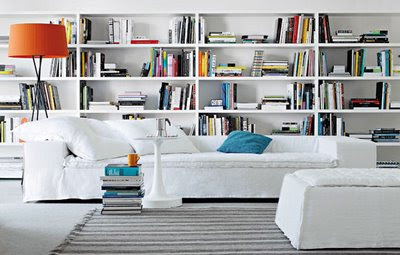
This is the offical dictionary definition:
tchotchke \CHOCH-kuh\, noun: A trinket; ... Tchotchke is from Yiddish tshatshke, "trinket," ultimately of Slavic origin.
 Patricia Gray
 Victoria Hagen
 Patricia Gray
  Purple Area
  Lamp by Tobias Wong
 Coat rack by Seattle artist Erich Ginder
  Patricia Gray Regina Chair
  Wing Back chair by Victoria Hagan
  Ghost Chair by Philip Starck
  John Saladino Porticus Bench


Domino Magazine 2. Bookshelves with ladders

 Purple Area
 Purple Area
3. Bookshelves in Offices


 Imperial Trellis Fabric - Kelly Wearstler
 Flickr
 Victoria Hagan
  Domino Magazine

 Purple Area
  Pieces Inc
  HollyHock LA
  Colorama
 I have long had a fixation with the color yellow, although I haven't used it much lately in my Interior Design projects I am always inspired by it. I need to change and use it more because I love it. Color researchers believe the color Yellow to increase self-esteem and strengthen the overall well-being. Yellow wakes up a room like the rising sun, it is cheerful and uplifting. I also find it to be a very CHIC color and am always attracted to it. It is supposed to have the longest memory retention of any color. So I used to use it when I did show suites. I would put yellow flowers or yellow pictures in the home so if people were looking at a lot of projects, mine would be remembered. It is also a good color to paint your house when you are wanting to sell it.....because yellow houses sell faster. Also yellow cars have fewer accidents.
 If you are like me and so many others with busy lifes and careers, I am always on the search for ways to simplify my life, organize my work, keep on top of things, file information so I can find it when I need it. So when I came across this book I thought maybe it held the answer.

A video of my art and art installations. I hope you enjoy it. "There is so much beauty everywhere I look. My desire is to capture ...

5 Interior Design Blogs We Couldn't Live Without This cleanly designed and beautifully photographed blog is the creation of a generous interior designer. Vancouver based Patricia Gray shares her keen eye for style, takes us on trips around the world and points out the resources and materials that she enjoys using on a job. The later is particularly useful for interior designers. It's great to see a master designer work, to look at her resources as they appear in finished spaces, and get an analysis of why and how they function beautifully. You also get the bonus of a well-trained feng shui expert, layered on top of this interior designer, and you can better understand why Patricia's interiors exude calm, serenity, and strong flow.
Patricia Gray is an interior designer par excellence with a pedigree that would wow anyone. Her innovative design work has been featured all over the world, and in many different publications (including the renowned Architectural Digest). Patricia's warm style and originality have helped skyrocket her to the top of the interior design world, and her blog reflects this. Design 55 UK
I love your blog......and view it every morning with my coffee to start the day in a good way.
Margie Hennig, Zürich Switzerland
I cannot tell you how much i enjoy your blog, I really feel that it is the best in the blog world. Love your inspirations.
Francine Gardner / Art de Vivre New York
Patricia, as always, your blog lifts my spirits by seeing such lovely things and all of them presented so magnificently. Brava!
Diane Farris / Diane Farris Gallery Vancouver
Patricia, you give us aspects of the world that we might never see; ideas to inspire us, pictures that move us emotionally, a view to a kinder, more artistic world that lies within our reach. This must take time and energy, and I am most thankful for your blog. J Marie Goodwin Vancouver
You have one very nice blog bravo !!!
Greetz Patrick Desmet, Artist Belgium
