Albert Hadley

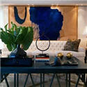
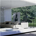
I love the bright colors that Albert Hadley uses. They act like punctuation marks. In the top left photo there is a hint of a bright orange door reflected in the mirror above the canary yellow sofa and a red zig-zag table. A constant that seems to be in all these photos is the use of black to ground everything. I think every room should have a touch of black. He also uses the most interesting shapes in furnishings and accessories, which seem to stand out all the more when they are juxtaposed with the bright colors and black.
photos via Peak of Chic


I respect and admire Albert Hadley tremendously (if I could manage half of his graciousness I would be very happy) - but I do miss the softness of Mrs. Parish's touch.
ReplyDeleteThey were the perfect balance. Mrs Parish with her exqisite taste in antiques and Albert from the Parsons School of Design with his thoroughly modern look.
ReplyDeletePunctuation marks are a great description!!
ReplyDeleteYes, notice how the lamp in the fourth picture is the focal point - a lamp! I like his quote too. I don't know about you, but sitting in a poor designed room makes me anxious and I guess, unhappy. My mind and eye races at the thoughts of what I would do differently. It's hard for me to be relaxed in a room I find "ugly." It truly does nuture the soul. But only a design freak understands that I think. 99% of the world don't get that.
ReplyDeleteJoni
Love the colors in the first picture!
ReplyDeleteI love his high contrast and unique pieces.Truly an icon.
ReplyDeleteThese photos make me think that I love yellow in decoration . i never used it but I think I will . it looks gorgeous
ReplyDeleteI love that quote and this post Patricia!!! More yellow too, which I've been seeing so much of and love. Great post!
ReplyDelete~Kate
Great post, Patricia! I love the bright touches....the yellow, the cerise. Beautiful!
ReplyDelete