My recent trip to Palm Springs was filled with excitement and one of the things on my list to see was The Viceroy Palm Springs Hotel . It was a glamorous Hollywood hideaway back in the 1930s and was refurbished 4 years ago by Kelly Wearstler of KWID Design Group into a sleek boutique Hotel. Clark Gable, Bing Crosby, Joan Crawford, and 32nd President Franklin Delano Roosevelt are a few of the famous past guests that frequented it. The Viceroy Palm Springs has gotten some great reviews and lately some not so great reviews. But I am only going to focus on my good review. It was a perfect afternoon. I was being driven around Palm Springs by my Dad on an Architectural tour of Screen Block Houses. And after a full afternoon we headed to the Viceroy Palm Springs to arrive just in time for our pre-dinner, late afternoon cocktail. I toured the grounds and snapped some pictures while the cocktails were being stirred and shaken.
We had a hard time finding the Viceroy Palm Springs Hotel as it is tucked away; except that after driving back and forth a few times I glanced up and saw Kelly Wearstler's iconic white porcelain dog statue on a balcony and bingo we were in.

Viceroy Palm Springs Hotel
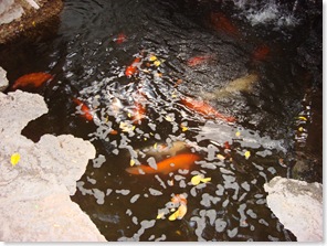
The Koi greeted us just inside the shady entrance courtyard. It was very inviting, much like entering a private home.
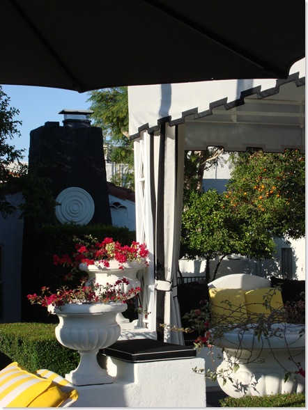
The grounds of the Viceroy Palm Springs, house several private Villas dating from the 30's. They had been updated by Kelly Wearstler with black & white awnings, draped verandas, front doors painted orange with shiny new polished chrome hardware.
The brick chimneys on some of the Villas had been painted black to match the awnings and a large white medallion was surface applied.

Viceroy Palm Springs Hotel
The Villas faced onto a central courtyard complete with a beautiful cabana with a pool in the rear.

Viceroy Palm Springs Hotel
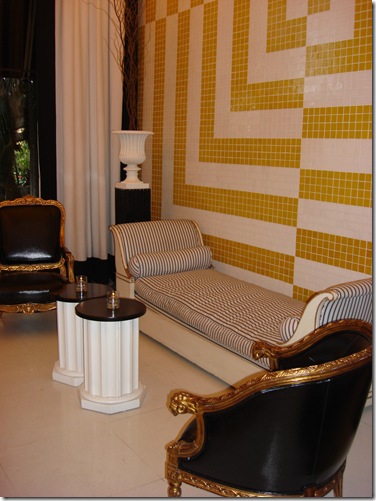
The Hotel was decorated in Yellow, White, Black, and Gray. The only deviation from this scheme was the orange front doors on the Villas
Beyond the pool to the rear of the property is the spa with massage tables set up inside of draped cabanas

Viceroy Palm Springs Hotel
The outdoor massage tables
Outdoor Showers Viceroy Palm Springs Hotel
The Citron Dining Room Viceroy Palm Springs Hotel
Outdoor dining for the Citron Viceroy Palm Springs Hotel
Facing onto the other pool which is behind the Citron Dining Room were outdoor dining cabanas

Dad and Joyce at Viceroy Palm Springs Hotel
My Dad and Joyce patiently waiting for me. Gin and Tonic's were welcome. The sun was low and the purple haze particular to that time of day was casting shadows on the mountains behind the Hotel.

Viceroy Palm Springs Hotel
The sun was creating a halo effect around the palm trees.
Leaving through the lobby and saying good-bye to the Koi

Viceroy Palm Springs Hotel
A perfect end to a perfect day
Other travel posts you might like:
Palm Springs Modern Architecture and the Use of Screen Block
My Visit to Palm Springs
Drinks at the Viceroy Palm Springs Hotel
Sunday in Milan Venice - The Old and the New
VENICE - Bauer Palladio Hotel & Spa, Giudecca Island, Redentore
ROME - Hotel Mascagni, Trevi Fountain, Spanish Steps, Piazza Barberini
FLORENCE - Hotel Santa Maria Novella, Uffizi, Accademia Gallery
LA, Dallas, and Meeting Joni
Patricia Gray writes about 'WHAT'S HOT 'in the world of Interior Design, new and emerging trends, modern design, architecture,
and travel, as well as how your surroundings can influence the world around you.
© Patricia Gray Interior Design Blog, 2009










That looks GORGEOUS!
ReplyDeleteWhat a lovely place, with so many memories of the past but still modern.
ReplyDeleteInteresting fabric of the awnings, quite different kind of stripes.
Your Dad looks very happy and Joyce is quite a lady!
Wow...nice!...What a great time of year to get away.
ReplyDeleteI love the niches and lovely little sitting areas. Can't wait to hear all about it!
Now I am running out and buy yellow and white tulips!
What a fantastic day! Thanks for the inside view! Yellow tulips sound like a great idea right about now!
ReplyDeleteHow stunning! I definitely need to visit the Viceroy.
ReplyDeleteI finally figured out how to get you on my blogroll with updated posts! It took me long enough.
Thanks for taking us along for the tour :-)
ReplyDeleteI love the orange doors with the chrome hardware. And the starburst mirrors in the Citron are stunning!!
The grounds are gorgeous too :-) Love the shot you took of the palm tree -- great angle!! :-)
Kelly
Hi Patricia
ReplyDeleteI so enjoyed reading this post! It made me feel I had also taken a short holiday with you. Can I also say what a lovely photo of your Dad and Joyce. The grounds look stunning and refreshing. You wouldnt have a care in the world staying at a place like that.
Mrs B
How fabulous for you to visit Palm Springs...I have been there many times but never visited the Viceroy...looks so lovey. This time of the year is definitely the time to go otherwise the heat is sweltering. Thanks for the beautiful tour.
ReplyDeleteIt was great to see the place from a tourist designer perspective. I have seen lots of photographs of the hotel but your pictures definitely fill my curiosity to see things from another angle.
ReplyDeleteThe place looks really well take care - which usually is not the case in this kind of trendy boutique hotels - at least in my experience.
Thank you for the tour. What a lovely place. So much class and elegance.
ReplyDeleteLooks lovely! Thanks for sharing the pics!
ReplyDeleteyou look gorgeous - you look like your dad too! did you have a gps ??? ahahah!!!!! "wrong turn"
ReplyDeletei never realized how quaint the Viceroy was! was anybody there? it looks empty. It's really so darling - I had no idea - thanks so much for giving it the Patricia touch!
Patricia - how lovely that you had your Dad along for company. Great shots - I love those yellow and white sun beds- a very oldy worldy South of France feel. xv
ReplyDeleteso beautiful.. love the color scheme
ReplyDeleteand also- your dad looks just like my stefather's father!!!! amazing
Your blog always makes me feel quite inspired and makes me want to get up and go see new and fresh ideas out there. You definitely have an eye for beauty in interiors/homes and architecture. Thank you for bringing them to view from my office! Have a great day!!!!
ReplyDeleteGreat post. Love the first photo. The Viceroy looks very Old Hollywood glam. Love the Red door. I would love to visit Palm Springs someday.
ReplyDeleteDear Patricia-
ReplyDeleteThanks so much for the rays of sunshine on a gloomy Boston day! Fabulous photos. Your dad is very distinguished looking and Joyce is positively aristocratic. What wonderful travel companions. At least Kelly Wearstler's design work seems to still look appealing even though she's moved on to a different style.
Thanks again-
Beautiful Images... And you have such an interesting blog.
ReplyDeleteThis post has inspired me to drape my front porches. I have been thinking about it for some time; however, I just needed this little visual push! When I think of Cali, this is quintesential old school with at twist! Fab design, fab post.
ReplyDeleteLoved that tour!! And especially the orange doors! Interesting thats the only place they used that colour! Look forward to seeing you tonight!
ReplyDeleteIt looks the the perfect place to re-charge. I love the drapery, want to hop up on one of those massage tables, and everywhere is your SPRING YELLOW : )
ReplyDeleteSign me up for a massage!
ReplyDeleteKWID did a wonderful job. It feels like old Hollywood glamour with a fresh twist. I love the bright yellow, and gray color scheme.
What fun.
xo
Brooke
Maybe that is why I loved the Viceroy because of all the Yellow and of course the weather
ReplyDeleteIn Palm Springs was perfect.
great pots. 26"??
ReplyDeleteHi Jane
ReplyDeleteI don’t know what size the pots were, but if you want to wait, I’ll hop back on the plane and measure them. Ha Ha…
Would I love an excuse to go back there.
If you really need to know, phone the Viceroy. I am sure they would be happy to oblige.
oh my gosh, do you ever look like your DAD!!!! only way more feminine!
ReplyDeleteThanks Ruth...
ReplyDeleteMy Dad is the BEST!!
looks great and sunny. The perfect place for me , right now ...
ReplyDeleteYour dad looks great ....
Hi Patricia,
ReplyDeleteAfter your reading your latest on the Viceroy in Palm Springs, I had to comment! Did you get a chance to go to the pub in the hotel? You might have met some old Hollywood types there.
My woman Treena, loves your blog and has actually started her own. She got me onto your blog and I love reading your updates. I'm a fellow Vancouvertite and have some close friends in the Palm Springs area. If you get a chance, please go to the Parker Hotel just outside "old" Palm Springs (down the road and across the canal from the Viceroy, on the other side of East Palm Canyon). It was totally designed by Jonathan Adler and quite a remarkable place. If you're still there, go see it, it's absolutely amazing.
I have a fondness for Mid-Century Modern & Hollywood Regency flair and you'll definitely see some at the hotel.
Best Regards & keep blogging!
Hi Bob
ReplyDeleteThanks so much for your comment and reading my Blog. Yes I did go to the Parker, although very briefly. I visited it on a tour of ‘screen block’ houses.
See the post that I just did on it: http://patriciagrayinc.blogspot.com/2009/03/palm-springs-modern-architecture-and.html
I also visited the newly remodeled Riviera Hotel, which is over the top. I got some great pictures of it.
I will be doing more posts on my visit to Palm Springs…so stay tuned.
Let me know the URL for Treena’s blog so I stop by it.
What great pictures you have taken. I want to go there.
ReplyDeleteI was just reading that they are opening up a new Viceroy in Mayakoba Mexico
ReplyDeleteOh and the site for it if any is interested is:
ReplyDeletehttp://www.viceroymayakoba.com/photos.aspx
I've just read this blog entry and i love it. I especially like the courtyard with the white cabana in the center. Also the citron dining room is great. I think i recognize some of the rooms from the Kelly Wearstler book you gave me a while ago. Its nice you met Grandpa and Joyce there as well.
ReplyDeleteYour nephew Sean
I see GREEN!!
ReplyDeleteOOOOOO I love the Landscaping of coarse! Its all the exterior rooms that just make it! The color scheme is perfectly relaxing!
Toast! LOL
Looks like you're next post was a continued fun visit! My favs are the ~fleur de lis ~Blocks!
Love the info!
Vanessa!
Great photos, thanks for sharing. I was watching Ugly Betty tonight and they had the same 4 white (cane?) chairs as the ones in your photo in front of the red door!
ReplyDeletesuper nice post !!!! funy the architecture look like kuwait old building when they start to spend the oil money , architects rushed over here to experiment new designs ... of course along the years , no maintenance poor construction quality and rude wather left them in a terrible shape .. today it's the labor force who are living in those amazing 60 s architecture , but little by little it turn back into sand ... and live space for futurist buildings ..
ReplyDeleteReally enjoyed your photos and Viceroy tour .. . . the black/white contrast is the perfect foil for the vibrant yellow stripes : also love topiary multiples .. . very effective!
ReplyDeleteAll in all quite '50's with an edge -
Judith
Thanks for your lovely emails and comments on this post.
ReplyDeleteYou are all amazing.
xx
Patricia
I really liked that forth picture of in the post, probably its the front of the hotel. I can see the spot lights and seems like the place would look allot more beautiful at night. Nice post.
ReplyDeleteAll these picture are looking so beautiful.Your blog is very simple and very nice.I like that kind of the blogs.I appreciate your work and hopefully you will continue your working like this.
ReplyDeleteThe new line is absolutely stunning! I have been so entertained by your blog,keep smiling and take care!
ReplyDeleteI love your work very much! Pangaea
ReplyDeleteIt looks the the perfect place to re-charge. I love the drapery, want to hop up on one of those massage tables and everywhere is your SPRING YELLOW
ReplyDeleteWeb Development Karachi
Nothing better than getting what you want from a post, kudos to you for this.
ReplyDelete