
And I mean a deep, dark, luscious Blue. It is showing up in walls, fabrics, carpets and accessories. It is a blue that doesn't have green or red in it. It is almost black and is warmer than lighter blues and has more life and depth than Black. It is the deepest shade of Indigo as seen in Ikat Textiles. It is the color of the sky on a moonlit night. It is mysterious, moody, classic, timeless, calming, and refreshing. It can have a glossy finish or be totally matt. It is beautiful when contrasted with pure white. My favorite Benjamin Moore paint colors are Polo Blue, Blackberry Punch, Kensington Blue, Blue Gaspe, Hale Navy, and Old Navy. Some deep blue colors are: sapphire, azure, beryl, cerulean, cobalt, indigo, navy, royal, midnight blue, slate, steel blue, Prussian blue.

The high gloss finish on this wall has a subtle reflectivity to it that changes at different times of the day and literally sparkles at night.

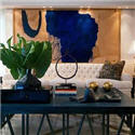
Alberto Pinto has used a deep blue in the bold geometric carpet as his only color in this wonderful Master Bedroom.

A deep and refreshing Mediterranean blue has been used on the walls at JK Capri Hotel in Italy.

A deep "French Blue" velvet for this classic chair.
I am in the process of designing a guest bedroom and I have chosen a deep blue silk for the curtains called Moonlight. I am putting a natural woven raffia roman shade on the window behind the curtains for some textural interest. The walls will be painted the same shade as the silk curtains: Benjamin Moore "Blue Gaspe". The Headboard is a heavy white Belgium linen. The bedding is white Egyptian cotton with an Hermes cashmere blanket in a deep charcoal color on the end of the bed. The carpet is wool and is the color of white coral. I will hang black and white "ocean" photographs that I have taken on my travels on the blue walls to finish it off.
Let me know if these deep luscious shades of blue are slated to become one of your new favorite colors?
Photo Credits from top: Dominio, Alberto Pinto, JK Capri Hotel, Jayson Home.
PATRICIA GRAY INC is an award winning interior design firm writing about lifestyle and
WHAT'S HOT in the world of interior design, architecture, art and travel.
2011 © Patricia Gray | Interior Design Blog™


The Color White – whether in a form of textiles, upholstery or finishes, White is still the cornerstone color for interior décor in 2010. Applied in a form of glossy or matte lacquer onto modern platform beds. In a form of leather or fabric upholstery on modern sofas and contemporary sectionals, or in a form of white glass on modern dining tables.
ReplyDeleteLove this color of bleu, almost a hear of the ocean blue or Prussia blue.
ReplyDeleteLovely,
Leslie
Stunning post! Glad I found your blog. Such Talent. Maria
ReplyDeleteThat room sounds so sexy...yet understated. I love it, if possible, please post photos once installed. That french chair is gorgeous!
ReplyDeleteAll the best,
Jaime
LOVE THIS! What a beautiful blue tone. You should check out the habitually chic blog, because they have a blue post right now too! And it's that same gorgeous dark blue that's in your post! Great minds think alike!
ReplyDeleteI'm just saying that even though I know neither one of you...=)
All so gorgeous...particularly the JK Capri Hotel! Tracey xx
ReplyDeleteOne time we were redesigning a space in our showroom. The painters did not have enough paint from the color I had chosen. We always have old pots of paint from old renovations, so to have the job finished that day I improvised and had them mix an ugly blue we had with black, and the end result, and by pure chance was something similar to the color in your first picture. I do not go for blues normally but that shade was just beautiful as you describe it. To my surprise it did not clash with anything and was deep and amazingly warm.
ReplyDeleteLove your pictures in this post and would like to see pictures of this room you are designing, you painted a beautiful picture for us.
Hi Patricia:
ReplyDeleteI gravitate towards the geometric deep blue rug, such a strong statement. I really like the shade of blue that you picked, it is quite sophisticated and vibrant.
You must be gearing up for the Olympics...
Wish i were there
Francine
I love the photos and your description of the bedroom you are designing. I can see it in front of me and I'm sure it will look great. I love blue and your pics have given me the courage to consider them more when decorating.
ReplyDeleteThanks for the inspiration.
I just did a post on blue rooms (inspired by Tobi fairley's House beautiful cover) I love Navy!
ReplyDeleteI once had a dark blue bedroom (and even darker blue ensuite bathroom) with white accents and a few pieces of McGuire rattan. I never slept better and when awake I really enjoyed the refined look (which was inspired by fashion stylist Sonia Rykiel's Parisian house). Looking forward to see your finished project.
ReplyDeleteDo you know of a shade at Sherwin Williams or Lowe's that matches this blue. Or where can you find this paint?
ReplyDeleteThank you!
sounds sumptuous! would love to see pics when it is all done!
ReplyDeleteThe guest bedroom you're designing sounds gorgeous!! I hope you'll be posting pictures of it when it's done.
ReplyDeleteI've always loved blue, especially cobalt & indigo blue.
The deep blues in the pictures you posted are beautiful -- dark, dramatic, moody, rich.... lovely!!
Kelly
Blue seems to be everywhere this year - From Magazine covers to blog entries, but I have to say that the selection of rooms to showcase this you have made is stunning!
ReplyDeleteI guess I know which colour I will be using in "Alberni Studios" next week (lol) Now we need the art to complement the interiors :)
I am not a 'blue' person per se, but I like these and it is because of the darker more black hue. Lovely,
ReplyDeleteDear Patricia
ReplyDeleteI so enjoy your blog! I especially love seeing your articles and reading about your work. Your designs are so talented, creative and sophisticated!
“Reinventing Blue” was interesting to me. A few years ago (2004 actually), my husband and I began building an adult lifestyle community on a piece of family property on the Bay of Quinte in Belleville Ontario. My husband is a chartered accountant and I am a librarian, so launching a new business as builders/developers was a challenge! We have an appreciation for beautiful homes, and our goal was to build an outstanding community on the water on the land that we had enjoyed for so many years. Six years later, our development is coming along, with 2 phases now built, and a 3rd phase in the planning stage. Our development is called St James By-The-Bay ( www.stjamesbythebay.com ). Back in 2004, the very first home that we built was a model home. I had a decorator helping me with colours, but somehow things didn’t quite go as well as I’d hoped. Our home was a 22’ wide townhome, and I had an open-concept living/dining room /kitchen that I was decorating. The kitchen cabinets were a light colour, pearlized café latte it was called, from Beckerman Kitchens. I had chosen light coloured fabric on the chairs and sofa, and had a creamy coloured fireplace mantel. The main wall behind the kitchen cabinets and the mantel was painted Barely Beige (BM CC140). When the colour went on, I was so disappointed because it did nothing for the cabinets. They needed to “pop”, but instead they just blended into the background. I spent hours sitting and looking at the wall wondering what I could do to change the effect. I had very little experience with decorating at that time, but needed to try something! I chose to do a dramatic look and painted the wall Kensington Blue (BM CC780). If I wanted to achieve “pop”, I was successful! I loved it, but at the time I got some very negative comments from people looking at the model home. However, more people liked it than didn’t, and since then I have seen several articles about the growing popularity of using dark blues! I personally love the colour Kensington Blue, as you do!
I look forward to more of your always thoughtful and enlightening blogs Patricia!
Bye for now,
Alanna
Alberto Pinto's room knocked my socks off!
ReplyDeletexx
happy valentine's day my dear!
My favourite blue is steel blue, te colour of the sea in the cool morning. Great photos, I enjoyed reading your blog!
ReplyDeleteBeautiful! I am loving the high gloss and laquered look, sooooo stunning.
ReplyDeleteI adventure in color. So many people are unwilling to dive in and commit to a strong paint color. These blues are luscious. A great color can really set off wall art Thanks for the pictures.
ReplyDeleteKate
I love the deep midnight blue wall. It is the perfect color for that formal space that you don't want to be predictable.
ReplyDeleteLove,love this bluish black color tone. That's exactly what I'll upholster my clients living room chairs in. So glad I'm still up late working. Thank you for posting.
ReplyDeleteColor can have an astounding effect on perceptions, feelings, and interactions. Different colors evoke different memories and different ideas. In the place, where one is supposed to be most at ease, it is important that you plan out your color scheme so that it creates the maximum comfort for you.
ReplyDeletetotally inspired
ReplyDeletebeen a brown / grey guy
you got me loving navy etc
thanks
ray
Hello!! I just discovered your blog today and I LOVE LOVE LOVE it. Especially the blue post...I went out on a limb and let my husband pick the color of our room, he chose a metallic navy blue by ralph lauren. I have been at my wits end trying to figure out how to work with it, but your post has me totally inspired. Thanks so much and cant wait to see your finished product!!!!!
ReplyDeleteColor can have an astounding effect on perceptions, feelings, and interactions. Different colors evoke different memories and different ideas. In the place, where one is supposed to be most at ease, it is important that you plan out your color scheme so that it creates the maximum comfort for you.
ReplyDeleteHave always been a fan of a deep blue black...I guess French blue....so rich and elegant!
ReplyDeleteI really like the geometric rug in the Alberto Pinto Master Bedroom. It gives the room a really cool energy. Great Post! -BC
ReplyDelete