
Color Experts Farrow & Ball Create 4 Key Color Trends for 2010
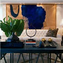
I just received the run down on the 2010 color trends from Farrow & Ball. They are all fresh and exciting combinations. I like the earthy shades in the Industrial color trends palette. The subtle, natural colors in the Aquatic color trends palette would be dreamy in a bedroom. I especially like the dark and dramatic colors in the Urban Decay color trends palette (Pitch Black No.256 is one of my all time favourite accent colors). And how can you top the Glitz & Glamour color trends palette for adding a bit of pizzazz to a room. I would stick with the neutrals for the largest areas (Cat's Paw No.240, Savage Ground No.213,Ringwold Ground No.208) and use the brighter accent colors sparingly, maybe incorporating them in artwork and accessories.
1. Industrial 2010 Color Trends: A strong but fragile fusion of colour.
Inspired by industrial architecture, this look is all about modernity mixed with tradition. Old and new are combined in an urban palette of muted tones that mimic the earthy shades of natural materials such as stone, clay, chalk and brick. Team soft grey based neutrals such as Cornforth White No.228 and Pavilion Gray No.242 with intense and inky darks such as Off-Black No.57 and Down Pipe No.26 to create a contemporary scheme. The deep, dramatic hues are accented and uplifted by splashes of vibrant, zestful colour with citrus shades such as Babouche No.223 or Orangery No.70.

2010 Color Trends
Key colours for the Farrow & Ball Industrial 2010 Color Trends :
Farrow & Ball Down Pipe No.26
Farrow & Ball Off-Black No.57
Farrow & Ball Pavilion Gray No.242
Farrow & Ball Cornforth White No.228
Farrow & Ball Setting Plaster No.231
Farrow & Ball Orangery No.70
Farrow & Ball Babouche No.223
Farrow & Ball Blackened No.2011
2. Aquatic 2010 Color Trends: A soft, watery palette defined by the elements.
This is a gentle, tranquil scheme. Subtle, natural colours are starkly contrasted with strong inky blues and combined with the reflective qualities of light, glass and mirrors for a diluted, watery look featuring freshwater tones. Try Strong White No.2001 or James White No.2010 teamed with the soft Pavilion Blue No.252 or Tunsgate Green No.250, and underpinned by Blue Ground No.210, Drawing Room Blue No.253 or Hague Blue No.30.

2010 Color Trends
Key colours for the Farrow & Ball Aquatic 2010 Color Trends:
Farrow & Ball Pavilion Blue No.252
Farrow & Ball Tunsgate Green No.250
Farrow & Ball Blue Ground No.210
Farrow & Ball James White No.2010
Farrow & Ball Hague Blue No.30
Farrow & Ball Strong White No.2001
Farrow & Ball Drawing Room Blue No.253
3. Urban Decay 2010 Color Trends: A vibrant scheme with an unpredictable twist.
Bold and graphic, this look is heavily influenced by the global economic meltdown and features the strong use of vibrant colours, but with an urban edge. Team dark and dramatic colours such as Pelt No.254 and Pitch Black No.256 together in a scheme for a theatrical look and experiment with paint finish as well as colour to make a real statement. Use Eco Full Gloss to create a high shine surface and inject with zingy, bright colours such as Arsenic No.214 and Dayroom Yellow No.233 for added impact and the ultimate visual scheme!

2010 Color Trends
Key colours for the Farrow & Ball Urban Decay 2010 Color Trends :
Farrow & Ball Pelt No.254
Farrow & Ball Pitch Black No.256
Farrow & Ball Oval Room Blue® No.85
Farrow & Ball Parma Gray® No.27
Farrow & Ball Dayroom Yellow No.233
Farrow & Ball Arsenic No.214
Farrow & Ball Great White No.2006
4. Glitz & Glamour 2010 Color Trends: A decadent look that celebrates excess.
In complete contrast to Urban Decay, this look is all about wealth and indulgence. Use rich and opulent shades like Brinjal No.222, Pitch Blue No.220 and Churlish Green No.251, alongside shimmering gold and metallics for an extravagant feel. This glamorous, glitzy look has a Middle Eastern influence, so colours include exotic shades which combine and collide in a celebration of colour and excess. Try Porphyry Pink No.49, Brinjal No.222 and Churlish Green No.251; a riot of colour with an adventurous twist. Key to this look is the myriad of colours – definitely not for the faint-hearted!

2010 Color Trends
Key colours for the Farrow & Ball Glitz & Glamour 2010 Color Trends :
Farrow & Ball Brinjal No.222
Farrow & Ball Cat's Paw No.240
Farrow & Ball Churlish Green No.251
Farrow & Ball Savage Ground No.213
Farrow & Ball Pitch Blue No.220
Farrow & Ball Porphyry Pink No.49
Farrow & Ball Cinder Rose No.246
Farrow & Ball Ringwold Ground No.208
What is your favourite 2010 Color Trends palette?
Please let me know by leaving a comment [here].
PATRICIA GRAY INC is an award winning interior design firm writing about lifestyle and
WHAT'S HOT in the world of interior design, architecture, art and travel.
2011 © Patricia Gray | Interior Design Blog™


I immediately loved the Gliz and Glamour. Feel like a kid in the candy store...could those be the next colours of smarties please!
ReplyDeletei am a real fan of farrow and ball. i would probably select color palate #1... but i honestly use so many of their colors in so many ways it would be hard to pin any down... i always love your posts... so full of wonderful information... thank you! x pam
ReplyDeleteVERY cool! Thanks for the heads up. Inspiring. I love F&B!
ReplyDeleteBetsy
I love the industrial colour trend - It feels elegant and sophisticated with some fun aspects to it.
ReplyDeleteSo glad to read about colour from somebody who goes beyond the obvious.
Oh my! #2 is totally my house at the moment! But I really liked #1 as well
ReplyDeleteWhere are the reds, pinks and other colours which denote passion and life ? These colour schemes are just nice not great. If these denote colour predictions for 2010, then as an interior designer I am going to go beyond them. These are just not enough.
ReplyDeleteGlitz and Glamour...although the Cinder Rose is throwing me a curveball that I don't feel like catching.
ReplyDeleteI love Urban Decay and would definitely use the colour combination. Glitz and Glamour follows as a close second because although I love the colours I can't quite visualise using the pallett in my own home. I would love a house big enough to sample the whole F&B range. Thanks for your blog. I am a huge London based fan. Teri-Anne
ReplyDeletethe industrial color palatte is exactly where i'm headed with our bedroom.
ReplyDeleteI like them all! I attended a color siminar for farrow & ball paints it was fantastic. Goody bag contained a sample of pitch black no. 256... Love it. Each color palate reminds me of different projects where they'd work.
ReplyDeleteLooking forward to 2010 new beginnings, projects and trends. Never a dull moment only waiting time with interior design.
Bette
I love the Glitz & Glamour palette - we all need a touch of glamour in these "pared down" days. Although the colours are not necessarily new (I've used colours similar to Cat's Paw and Churlish Green for years) putting them together is very fresh. It's great to get a peek at what the new trends are going to be.
ReplyDeleteLovely palettes for 2010! Similar to BM's forecast.
ReplyDeletexo,
cristin
Love the industrial...
ReplyDeleteSo interesting - the first color palette was exactly what I used in a house we built in 2002. I had slate floors, concrete counter tops, the walls were a yellow/mustard tone, the cabinets were oatmeal on top and black on the bottom.....pale yellow marble in a matte finish on the island. Still love it!!
ReplyDeletei found all the selections chilling and lifeless, even #4. perhaps we are going into such a period for economic and social reasons, but i don't feel comfortable with these colorways. 'industrial' isn't where a bedroom should be going. or a dining room or parlor.
ReplyDeleteI love a stark white background, a range of neutrals for upholstery, silver (blinds, mirrors, floor and lamps), red/orange/purple range for accents with a punch or two of black, topped with an exceptional oriental rug and fabulous art. Just finished doing the living room. Spectacular!
ReplyDeleteNumber one is number one. I have used the same colors but with black on the floor, and it looks stunning.
ReplyDeleteI like the Industrial and the Aquatic. I like too that black was in more than one!
ReplyDeleteTheir paint is so creamy and nice!
I LOVE the first pallete. Some of the pinks in the others I am not so sure about. (for walls) I like pink for clothes
ReplyDeleteActually, I don't like any of them.
ReplyDeleteI love the industrial architect, color palatte and equally adore the glam and wealth of the last option.
ReplyDeleteThe Industrial palette, easier to relate to and can last longer. don't think I'll get tired of it very quickly as apposed to the other palettes. I would use it for my next project - Great inspiration!
ReplyDeleteI love color combo #2!! Do you have access to this information as a designer or can the general public access it as well. Thank you for a very informative post, it is very helpful.
ReplyDeleteWhat a great feature. Thanks for posting!
ReplyDeleteAll the best,
Michael
Oooo I like them all but if I have to pick a fave it would be #3. Love Farrow & Ball - great British company!
ReplyDeleteHi AK
ReplyDeleteYou can get more information on the Farrow & Ball website.
Urban Decay #3
ReplyDeleteGlitz & Glamour all the way
ReplyDeleteIndustrial by far I am an orange person in any shade.
ReplyDeleteGlitz and Glamour is yummy.
ReplyDeleteIndustrial is great love it will work well with so many style.Margo
# 1
ReplyDeletefor sure.
the rest are alright, but nothing i would be excited working with right now.
oh, that's right, i am not too excited about work at all these days.
LOL
xx
Love Glitz & Glamour - Nobody does it better than Farrow & Ball!
ReplyDeleteLove Glitz & Glamour - Nobody does it better than Farrow & Ball!
ReplyDeletewow they are great palettes! love the schemes - maybe too late for my current home this year, maybe next year (2011)!
ReplyDeletelove number 1,,, the orange mix with the other colors kind of make me go back on time and at the same time makes me think about bold color,, modern furniture and a mix of old and new!!!!!
ReplyDeleteHi, pleased to meet you
ReplyDeleteloving this blogg
Come pay a visit some time
It's amazing how ten years ago I removed gray from any clients interiors like it was the plague! Today - variations of gray, from icy blue to deep gray mixed with mustard yellows I can't get enough of. Very subdued, bold anc chic all at once.
ReplyDeleteThe Industrial palette is my favorite. I love all the grays, they look so wonderful with splashes of color.
ReplyDeleteI love all these palettes !! But it depends of where I put it I will choose :Glitz and glamour for my bedroom , Urban decay for my office and living room and aquatic trends for our beach house ...
ReplyDeleteThanks for your insipring post
Hi Patricia!
ReplyDeleteHave missed you! love the post! take care!
Michelle
Thanks for all the helpful advice.
ReplyDeleteIt is between 1 and 3 and I think 3 is the one, although I am definitely inspired to create a painting with the #1palette as well.
ReplyDeleteOh and yes I have missed you Patricia!!
ReplyDeleteGlitz and Glamour is the best, with Urban Decay as the second. The Aquatic has been done every spring and summer since the beginning of time, and the greys and yellows of the Industrial palette are very 2009- so tired.
ReplyDeleteI think my favorite color for 2010 will have some sort of oyster tone to it, be it a metallic or not. I am love the feeling of oyster, brass and of course a mango orange.
ReplyDeletepve
I like the names for these 2010 Color Trends.
ReplyDeleteBeautiful colours!
ReplyDeleteThanks for the inspriation! Love the Celeb/glam! I am a single gal decorating my first "real" place...was lacking any fresh ideas til now!
ReplyDeleteI love the industrial trends it has more modern feel to it.
ReplyDeleteLove these colour palet! Franca
ReplyDeleteLove LOVE love the Aquatic theme but I would throw in black too.
ReplyDeleteIt makes me want to run out and repaint the whole house. ;)
The Aquatic palette offers so much potential. The combination of Blue Ground and Pavillion Blue is particularly fetching. I noticed the same combination in an Apartment Therapy book this morning. It featured a reclaimed turquoise 3D letter "D" hung on a sea-foam green wall--unexpected and gorgeous.
ReplyDelete#1 Would be my first choice (Farrow and Ball), followed closely by #4 (Glitz and Glamour) without/replacing the Pitch Blue.
ReplyDeleteIndustrial!
ReplyDeleteF&B the only paint to use
ReplyDelete#1 with the yellow really new
thanks for sharing
ray
Loving this blogg... thanks Patricia ur really helpful
ReplyDeleteThe subtle, natural colors in the Aquatic color trends palette would be dreamy in a bedroom. I especially like the dark and dramatic colors in the Urban Decay color trends palette (Pitch Black No.256 is one of my all time favourite accent colors). And how can you top the Glitz & Glamour color trends palette for adding a bit of pizzazz to a room. I would stick with the neutrals for the largest areas (Cat's Paw No.240, Savage Ground No.213,Ringwold Ground No.208) and use the brighter accent colors sparingly, maybe incorporating them in artwork and accessories.
ReplyDeleteGlitz and Glamour...although the Cinder Rose is throwing me a curveball that I don't feel like catching
ReplyDelete