Yellow tulips speak to me of Spring and the promise of sunshine. What could be more optimistic than that?
Pantone, the global authority on color and provider of professional color standards for the design industry has selected 'Mimosa', a warm, engaging yellow, as the Color of the Year for 2009. It was selected for the view that the world is in a time of economic and political change and for the fact that yellow more than any other color represents optimism, hope and reassurance. "The color yellow exemplifies the warmth and nurturing quality of the sun, properties we as humans are naturally drawn to for reassurance," explains Leatrice Eiseman, executive director of the Pantone Color Institute®. "Mimosa also speaks to enlightenment, as it is a hue that sparks imagination and innovation."
While all the above testaments to the effects of yellow on the psyche are so true, yellow is a color that is a tried and true favourite and has been used abundantly throughout the annals of time. Although I don't subscribe to the fickle market trends of color ......thank-you very much Pantone for your re-packaging and re-marketing of the color Yellow and for giving it it's year of fame!!
Sunset in Morocco taken by my girlfriend Ann on her desert safari expedition 2007.
Yellow lanterns on the Island of Giudecca for the famous Rendentore fireworks celebration 2008
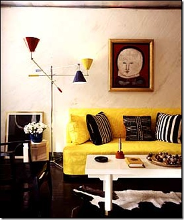
Albert Hadley was using yellow in his designs in the 80's
David Hicks (left) used yellow in the 70's
Conran has introduced a yellow velvet for this sofa (left) just in time to catch the yellow wave. A yellow ottoman at the showroom of Dennis & Leen in Los Angeles that I was attracted to on a visit in 2008 (right)

Yellow toss cushions and trim on draperies add a lively spark to these rooms. EKB Interiors
Jeffery Bilhuber's famous library using the iconic yellow of the National Geographic magazines
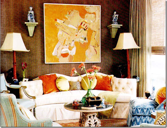
Yellow in large scale abstract artwork
Yellow wall coverings KWID
Framed wall paper panels by the fabulous Maison 21
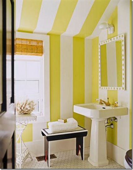
Bold & graphic yellow stripes in this bathroom
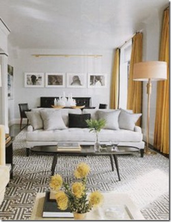
Yellow for draperies
Fabric and trim from my files for a Master Bedroom I designed in the 90's
Clarence House Silk draperies
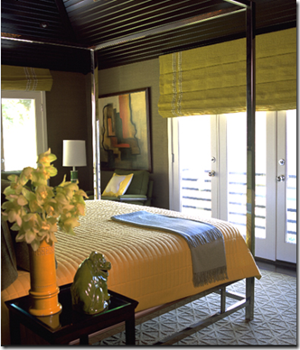
Yellow Bedding
Yellow paint for walls. Benjamin Moore's St Elmo's Fire is a great yellow with just a touch of green in it.
Yellow slipcovered dining chairs Vicente Wolf
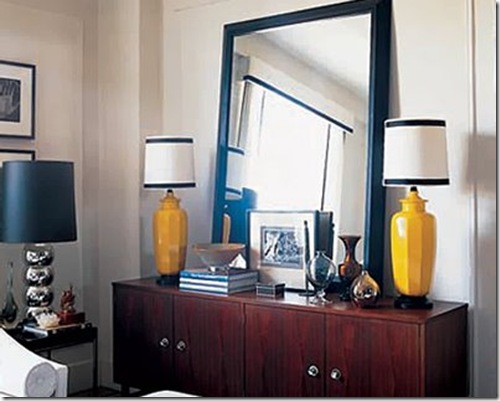
Yellow lamps were starting to show up in abundance in 2008
Jan Showers lamp (left) Michael Devine fabric (right)
One of my favourite pieces of artwork by Kenton Nelson View as a slide show below............
What do you think? Is yellow a color you will want to introduce into your home in 2009, or will you be content to let others use it?
Click here to read a post I did on the color Yellow February 2008
Patricia Gray writes about emerging trends, her inspirations, and "What's HOT" in the world of Design, as well as sneak peaks of her work.. While you're here, subscribe to this feed so you don't miss out.


















I love and adore this post! I never get tired of yellow. And in my travels as a colour consultant, when I arrive at a clients house with yellow as the main colour, they always say - "I love it, but it's too much everywhere, can you help me pick some colours that go with the existing yellow already in the house?" And Kenton Nelson, wasn't that the artwork in 'Something's Gotta Give' movie. . . it looks so familiar.
ReplyDeleteI have been thinking about yellow chairs, maybe some Eames like the ones in the link below
ReplyDeletehttp://karina-elbeso.blogspot.com/2008/12/designer-house.htmlames,
I like the yellow - in small doses - but too much would irritate me. It's also hard to work with in print. I just used this color yellow paper for the cover of my IFDA chapter newsletter - and it came out much more garish than happy!
ReplyDeleteYellow is so vibrant, so for me, I like it in hits; depending on the saturation I guess. I really like paler yellow tones or even yellow/whites.
ReplyDeleteAnd of course...yellow tulips!
I so look forward to your posts, and this is a goodie! The David Hicks space is my favorite :)
I am certain now that Michelle Obama knew about MIMOSA when she selected her inaugural day ensemble. Perfection- and thanks for the great post- I have just completed a room in grays with YELLOW-(now to be called Mimosa)- accents-a pr of Lamps, Dec Walk yellow fauxFortuny on the chairs and and another pop of yellow in a Lee Jofa embroidered silk. Yellow! What could be sweeter than jonquils?
ReplyDeleteHi Maria
ReplyDeleteYou have a good eye...Kenton Nelson is the painter of the picture in the entry foyer and masterbedroom in Something's Gotta Give. Good noticing.
Cara Patricia,
ReplyDeleteThanks for all the "yellow pages". So inspiring. The large scale abstract work! Wow! If you cannot afford it, at least yellow tulips work wonders. Have been waiting for the Mimosa to paint the gardens. This year - with the financial situation(?)- we are still waiting! Bacione, Ingrid
This post is just what I wanted to see on a cloudy morning- thanks! I am about to help a friend transition her LR towards yellow so all of these pictures are helpful and inspiring.
ReplyDeleteBeautiful Post!
ReplyDeleteWow so many beautiful pictures!!! I don't know where to start!! I think my favorties are the velvet ottoman under the console, the Clarence House draperies and the Benjamin Moore St.Elmo's Fire. awesome post.
ReplyDeleteAs you know I love colours in a house, they reflect the owner's personality. Yellow is definetely a colour which can be vibrant like the full sun or subtle like a pound of butter (real butter of course).
ReplyDeleteIn any case it creates a cheerful mood.
Thanks for inspiring me every time I read your Posts.
Ciao from Italy (still here but back in Vancouver soon with lots of news).
Albarosa
Thank you for brightening up my blah monday. While yellow has been used for years in nursery's and little kids rooms I love seeing the jump into other rooms. I love how vibrante the color is and it really does put me in a great mood. I love all of the pictures you picked. Especially that living shot from Eileen Kathyrn Boyd it's one of my favorites. I love the combination of yellow and gray.
ReplyDeleteI'm also a fan of Kenton Nelson's work. It tooks Something's gotta give for me to find this artist, but I love the shot you picked. I had heard that Jack Nickelson actually was the one that picked it out.
Great taste.
Lovely post.
I like the bathroom design. I will definitely apply it in my design. Thanks for sharing.
ReplyDeleteI absolutely love yellow and think it will be big this year yes, it does represent hope...lots of good pix in this post...Despite the economy we have all things yellow to cheer us up...I'll go back to this post many times.Thanks... Fay
ReplyDeleteHi Patricia! I LOVED this post. Yellow always makes me happy!
ReplyDeleteI love that painting at the bottom. It reminds me a little bit of one of my favorite artists, Alex Katz.
becky
I love this post, what a beautiful collection of photos with all kinds of yellow! I love the color yellow, and when I heard it was the 2009 color of the year I was so excited!
ReplyDeleteI love these images and especially Maison's new living room with the wallpaper panels - I adore that room! and you!
ReplyDeleteI think just about every creative colour scheme should have a touch of yellow! It really adds life!
ReplyDeleteWhat a beautiful well researched post. Thanks Patricia, as always you have such informative posts.
ReplyDeleteI have always liked yellow, it brings the sun in regardless of the weather and makes your heart sing. Lately though I have been finding it a bit tough to use it in large quantities. I have a yellow room at home that was done in the mid 90's with little change since then, now i think i would change it to something a bit more neutral and natural. I would rather accent with yellow. But mimosa is among my favorite shades. Thanks again
Yellow is really popular in weddings right now to and I love it! You're right - its so bright, fresh and SPRINGish - and heaven knows we could use some spring lol.
ReplyDeleteI am an yellow fan ! yellow is already into my home ! J'adore the sun yellow as I call it ( jaune soleil) it is a very brightful yellow , it is on my bedroom curtains , yellow plain curtains with black and white dreek trimming on it
ReplyDeleteI adore the color yellow in a home, it brightens up any room without being overpowering. I love the pavilion stripes in the bathroom. I like the way it accentuates the lines between the wall and the ceiling; and the framed wall paper panels are also amazing! This was certainly a pick me up! Thank you for a lovely and inspiring post!
ReplyDeleteI always love to go to the art supply store to see which tubes of paint are lacking and that is a sure indicator what is hot, no "jaune citron" - must be on the up.
ReplyDeleteI love the turk color now with yellows-
Great post -- and such amazing pictures. I love both Albert Hadley and Kelly Wearstler's work so it was wonderful to see them both in there... :)
ReplyDeleteYellow is definately hot this year! I'm waiting to buy the new bright yellow Doc Marten boots, which apparently will be released into the stores in a month or two (along with bright blue, green, and red).
ReplyDeleteThis has to be one of my favortes of your posts! Patricia I have nominated you for this contest.
ReplyDeletehttp://artbykarena.blogspot.com/2009/01/pay-it-forward-and-share-luv.html
Hi Patricia
ReplyDeleteHope you are well and enjoying yellow! That was the 2nd post you did on the color. Good for the January blues! It brightened my day.
I think that I will use some touches of yellow in my home this year by adding it in artwork and toss cushions. Thanks for the good suggestions and all the pictures are lovely.
ReplyDeleteI was so excited to see this post as Yellow is my very favourite color.
ReplyDeleteI love it, I used my husbands National Geographic Magazines Collection to add yellow touches to our otherwise neutral living room.
ReplyDeleteA beautiful post! I am very timid of yellow and don't like it terribly much, to be honest. But I love a touch of it, like the draperies you show. I think if I had a bigger decorating budget, I could be more adventurous with colour (but I am always trying to be practical and "go with everything"-ish).
ReplyDeleteI was reading the other day that in tough economic times, people decorate in bright colours, while in stable prosperous times, people go back to the classics (beige and grey). Isn't that something? Well, we have been in the neutral phase a long time, so perhaps we are overdue for a lick of vivid colour in our lives?!
Wonderful collection for this post!
I have never been a big fan of yellow, but your fabulous images have me convinced that it is a very positive and "spring" color.
ReplyDeleteLOVE your favorite curves - fireplace sculptures.
Yum! Yum! Yum! Yellow is so Yum!
ReplyDeleteI love the fact that Yellow is here. We need some fun and happiness in these times.
Patricia, what an absolutely delightful collection of images! The David Hicks room from the 90's is beautiful! Loved that you also included pages from your files. Lovely post.
ReplyDeleteGreat post, as usual. But, I think Pantone missed the mark on this. In nature yellow is great: the first daffodils of spring, golden wheat fields, sunflowers - all amazing. Even yellow exteriors can be striking. However, I am always disappointed in yellow as an interior colour. Perhaps it is our Northern exposure. But often I find it drab and dated, lacking the vibrancy which in nature makes it so captivating. Not to mention that if you have even the slightest of olive complexions, as I have, you look sickly, tired and just generally unwell in yellow. It is a difficult colour and not one that I would use. Thanks again for a great post.
ReplyDeleteI like yellow but I'm thrilled to see that the "yellow wave" as you call it has long passed. Anyone hip did yellow in 2006/2007 and luckily, they've now left yellow to those of us who always loved it and always will, trends be damned!
ReplyDeletehello!
ReplyDeleteThis post was really helpful for me.
i was thinking new ideas in using colors in house furniture.This post inspired me to use yellow and I'm into it now.
thanks