
successfully incorporate orange walls in your home.
You can successfully incorporate orange walls in your design by choosing the right rooms, complementary colors and accessories.
Orange is a vibrant, happy, social color. An orange wall can bring a dynamic energy to any room. It can simultaneously brighten a space while warming it up. Paired with the right colors and accessories, a large swath of orange can make a room really shine. But orange walls haven’t always been an easy sell to homeowners. An orange wall need not look like a giant homage to the citrus fruit; many different hues of this inviting, invigorating color exist in the paint world. Patricia Gray of Patricia Gray Interior Design in Vancouver, British Columbia, has selected three Sherwin-Williams paint colors that she feels illustrate the diversity of orange:
- Husky Orange Sherwin-Williams 6636: "Husky Orange features rusty tones with more brown in it, and I find that this color is a lot more acceptable to a broader range of people. It is one of my favorite colors for using in living rooms, libraries and family rooms."
- Tango Sherwin-Williams 6649: "Tango Orange is what I would call more of a mid-range orange, a current and hip color. I would use it for a focal wall in the living room or dining room; it would also be fun for an entryway."
- Kumquat Sherwin-Williams 6648: "Kumquat is beautiful because it tends to go into the peach tones, but it’s an upbeat and livelier tone than what we were inundated with in the ’80s. I find that Kumquat is very relaxing and soothing, which makes it ideal for a bedroom, sitting room or anyplace where you want a quieter mood."
Like any dramatic color used abundantly, orange needs its counterparts.
"White or cream help balance the heat of the color," Gray says.
"Chocolate browns and charcoal grays are also accents that balance and coordinate nicely."


Sherwin-Williams Husky Orange 6636
An example of what might look like on a wall in a living room or family room.
Photo Jeffery Bilhuber


Sherwin-Williams Tango Orange 6649
An example of what Tango Orange might look like on a wall in a dining room. in a dining room.
Photo Antonia Hutt


Sherwin-Williams Kumquat Orange 6648
An example of what Kumquat Orange might this color might look like in a kitchen on a backsplash of back painted glass.
The glass gives this color more vibrancy.
Photo Jennifer Gilmer
** Colors may show differently on computer monitors than in real life. I always recommend painting a sample test.
Have you used orange paint in your home?
Do you think that you are likely to use orange in your home in the near future?
If so please let me know about it by leaving a comment.

Read full article at Sherwin-Williams Stir
Read another article on The Color Orange where I give examples of Benjamin Moore Colors.
Patricia Gray writes about 'WHAT'S HOT 'in the world of Interior Design, new and emerging trends, modern design,
architecture, and travel, as well as how your surroundings can influence the world around you.
© Patricia Gray Interior Design Blog, 2009


These are all done so well. It is a hard color to get right, thanks for the link. I was very close to doing orange walls for a client once and decided not to and it was the right decision. This is good direction for the future!
ReplyDeleteLove this article, well said. Orange is tricky for some people because when you say 'orange' people go to the primary colour in their head (like yellow) but there are so many different shades of orange like you've described!
ReplyDeleteLove the images you've shown as well!
I really like the orange back-painted backsplash. I think that one is my favourite of the three oranges described in the article.
ReplyDeleteI painted the living room in our last house a sort of terra cotta orange with a ragging faux finish. Don't moan, it looked cool, really!! I was really into southwestern style at the time, and it reminded me of adobe walls :-)
I probably won't be using orange in our current house, but I'm using an orange and lime green colour scheme on the patio in the backyard :-)
Kelly
great color....I just painted my bedroom salmon! luv it!
ReplyDeleteI'm really warming up to orange, and it's becoming one of my favorite colours. It was all the rage (and most dominant accent color) at the Hospitality Design Expo in Vegas last week.
ReplyDeleteDifficult colour to use but this is a really nice piece you have written. I love the kitchen backsplash.
ReplyDeleteOrange is used here mostly with ethnic decor--more rajasthani look and feel. It's nice to see it in a contemporary setting
I love the orange and lime green combination
Dear Patricia,
ReplyDeletethis is an interesting subject about colours.
I have always believed it's a matter of finding the right shade ( of any colour) to go well with the rest, but´s also about achieving the wanted effect. That is sometimes a challenge, yet great fun...
My running customer project includes silky chocolate brown with beige, white and a little gold. I can picture an earthy shade of orange on the walls.
So thanks for the advice.
Take good care,
Ingela
Loved the picutres. As everyone said it is a difficult color to use. I once painted a room orange back in the days when effects were in, it was almost sponged and I hated it from day one. It was a West facing room and in the afternoon it became like sitting in a furnace. Could not wait to change it to a neutral.
ReplyDeleteI have a project now were I am using a bright orange for one wall as an accent. I like the color and how it can go with ethnic or modern.
Congrats on the feature! Orange is one of my favorite shades! Always love your picks on colors!
ReplyDeleteHope you are doing well!
Take Care!
Zuniga Interiors
My office at home is SW 6354 Armagnac...I love it!
ReplyDeleteA guest bath is SW 6352 Soft Apricot...I've also used this in a client's bedroom. It glows beautifully throughout the day.
I'm dying to use SW 6643 Yam.
Obviously I'm an orange lover...all of its varying shades.
Congratulations on the feature!
ReplyDeleteLove the orange in the dining room and in the kitchen. The glass back splash is genius.
Tricia - Avolli
Hi Patricia,
ReplyDeleteGreat interview and advice.
As you said so well orange is vibrant, happy, social. The dining room creates this atmosphere.
Hermes orange boxes and brown ribbons are another perfect example.
love love love !!!!
ReplyDeletewhat a super article.
i am particularly fond of back painted glass.
i love that orange back-splash the best !
Bravo Miss Patricia !
xx
I find picking out colors to be such a challenge.
ReplyDeleteI always welcome the color advice from designers I admire like you. The images and orange tones you selected are beautiful.
xo
Brooke
Kumkuat = Yuminess! (lol) - I have to see that colour in person. I love the fruit, but to be honest I never thought to place that colour in a wall.
ReplyDeleteI am just right now so thinking about color and I saw a fabulous orange at Gore Dean's Blog: she posted on a show house design by Camille Saum, the dining room was painted in Farrow & Balls orangery, with purple accents, beautifully done!
ReplyDeleteIf you want to have a quick look find it on my blog list via Pigtown*Design blog.
I am a " colors girl" I guess , orange is one of my favorite and a lot of my friends are making fun out of me because of that . My teenager bedroom was orange and I love it very much. Now the curtains of my living room are very orange . I think orange match perfectly with a lot of colors but above all chocolate and blue.
ReplyDeleteI would love to paint my wall coral orange
yay for orange!
ReplyDeletePatricia,
ReplyDeleteI love these. I am working with a client in Buckhead and we are leaning towards Tango for her LR...will be fab!
Blessings...
Great post! I love vibrant colours!
ReplyDeletelove orange paint, love to eat oranges... and love this post..fabulous as always...
ReplyDeleteYesterday I was remembering a very funny story.
ReplyDeleteWhen I moved with my partner the first time, we did some painting in a our new love nest. I selected the colours for the rest of the apartment but my partner a software engineer wanted (in a very stubborn voice) a yellow bathroom so he selected a yellow by Ralph Lauren called Mango Gold - well the result was very hideous and we look so unhealthy every morning. I never looked so pale in my life (lol) and I am already pale.
Then one weekend while Jeff was out of town I selected a new warm colour - Baja Orange by Ralph Lauren Number: IB62 and it looked amazing and also we looked healthy and happy. Even Jeff loved it :)
We had white subway tiles and hexagonal ceramic floor tile - very 1930's and I also got some white and navy blue towels. The bathroom turned to be the coolest thing ever and it was so unique because it was a very old building and nobody thinks that orange will work in a bathroom. The best thing is that it complemented our skin colour and we looked really good every morning.
Today I have a taupe colour in my bathroom walls, but my towels are Rust Orange - well the result is that I still feel that I look good every morning :)
Orange is one of my favorites! Thanks for the feature.
ReplyDeleteBetsy
These pictures are lovely! Everytime someone mentions orange i remember an interview i saw a few years back that no one used this color ever. Seems we've come into a new era because i see it everywher in all types of hues.
ReplyDelete~Great post~
You should stop by my blog as i have a lovely giveaway you just might be interested in.
Hope you have a wonderful weekend!
yesterday I was with a client , she pop up the idea of orange... I froze .
ReplyDeleteit's because it's the cousin of brown and mustard and the misusing of those colors around me made me so sick that I totally develop an allergies ,,,, what to do !!!?? help... hermes lunch box maybe?
Orange is one of my most favourite colours! Even so, it was scary to actually paint my dining room in that colour (BM's Bronze Tone). Fear didn't last long - I love it!! Now, I need art on a long expanse of a wall and I'm crazy about the piece in your first photo. Something like would be fantastic!
ReplyDeleteThanks for the fun post, Patricia!
Victoria @ DesignTies
I'm loving orange! Growing up it was my mothers favorite color, and our home had lots of orange! I remember the fake tree my mother loved with orange grapes hanging off it! ( causing me to believe grapes could be orange and grow on a tree!) LOL
ReplyDeletexoxo,
Cathleen
I am not a color person but this i like! Love all the art work in the rooms and the orange Hermes boxes are fantastic.
ReplyDeleteI adore that kitchen! Orange is my favorite color of all time. When I was a little kid my father would frown upon my hip orange jumpsuit (thankfully no photos of that) ...he said I looked like an escaped convict. Still out of the clink but it certainly influenced me...and my favorite color.
ReplyDeleteCongrats on the article! Personally, I am very obsessed with orange...such a great color- just featured this post in our MG Weekender newsletter- goes out today!
ReplyDeletelove the orange.. never would have thought of painting a room that.. but looks good.
ReplyDeleteHi! I am a restaurant interior designer. I like your design. It is just simple but look.. very nice..! keep it up!
ReplyDeleteOrange is not a favorite color for all but thanks for sharing this post with us all. I really enjoy checking out your posts Patricia they are always so inspiring.
ReplyDeleteI liked the Sherwin-Williams Tango Orange used in the living room walls.
Great inspiration!
Mrs. E. and I painted the library orange after a Penguin paperback inspired the choice. Then we stippled it with a red varnish. Now we've got to change the carpet... It is an exciting colour with which to live, though.
ReplyDeleteI appreciate the labour you have put in developing this blog. Nice and informative.
ReplyDeleteHi Patricia, thanks so much for the article...and for the recommendation of orange colors...there's not too much out there. If I went with a Tango Orange or Husky Orange accent wall, what color would you recommend for the other walls. I'm thinking either a light brown or cream color...suggestions anyone?
ReplyDeleteOrange is one of my favorite color. I also used this color on my office wall.
ReplyDeleteAgain its a nice article with great information.
thanks with regards
interior decorators
ORANGE is my favorite color! Love the choice of 3 different options.
ReplyDeleteI used orange paint to jazz up my kitchen pantry walls.
Lovely, lovely. I've used orange in my decor but stuck with accessories and it has worked very nicely.
ReplyDeleteWe are buying a house in Lake Havasu, Arizona and it has large orange Saleto tile and my first thought was to use cream so the article was good for me because the whole living space is orange.Thanks Irene
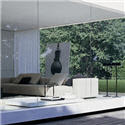
ReplyDeleteI love colour and orange has increasingly become a favourite. I would like to use orange in my home but wasn't sure if I could since I have quite a bit of red. Still, it is a rust red or warm pink sort of red, definitely not a cool red. I like the husky and the kumquat. I love the top picture on this post. I really like the orange and cream combination. I have a cream and blue bedroom and am thinking of using some orange in there. Probably in textiles though not paint. May I post that top picture on my blog as an image/room I love?
ReplyDeleteYes...I used a lovely orange in my dining room and loved what it did for adding warmth and casting a lovely glow. Also did a ginger orange in my laundry and half bath because it was so cheerful. The only thing I find about orange is that it's easy to tire of quickly. So I repainted the dining room after 3 years and am in the process of repainting the laundry etc.
ReplyDeleteOh, orange paint is good in the living room. I haven't tried to explore other bright colors for my home. I only use white color and sometimes wall papers. I'm planning to redesign my living room (I don't know when!). My living room looks lifeless. I want to try to use bright colors like orange or light blue for my walls. Maybe I'll add some hand forged home accents like hand forged iron hooks to add life to my living room.
ReplyDeleteThis is great. We used Orange throughout our dinning room and it came out amazing. A little tip...hire painters! We used College Pro Painters and were very pleased with the results.
ReplyDeleteThe orange looks absolutely brilliant.
I particularly like the kitchen. The orange goes well with the bronze metal and woods and pops with the white. I will consider using orange in the kitchen.
ReplyDeleteI used a Terra-Cotta Orange in an office on a 40' wall. The wall already had a crow-foot texture. After applying the paint, I divided the wall into 3 areas and applied glaze as a Frotage. One section received Modern Master Copper Metallic in the Extender; the 2nd section received Copper Irridescent, and Gold Irridescent was used on the 3rd part.
I am pleased with the results. I like the Gold irridescent as it gives an Egyptian feel, however the Copper Metallic receives the most comments.
I live in Arizona, and the houses here are always painted with the desert browns and tans here. Thankfully I don't live in a strict homeowner's association community. My house is a vibrant orange that is tinted red and I've been playing with the trimming colors. I've discovered that green is the best complimentary color.
ReplyDeleteAnyhow, my neighbors loved it so much that the other three corner houses at our intersection have painted with shades of orange and green. If you ever happen to meet and intersection in Arizona with four orange houses, :) you've found me.
Hi Patricia - I love your blog (don't know why this post got by me though!). I love using orange but it is a tricky color. I used it in my great room - but I did add some cinnamon tones to it and I used a soft suede like plaster on the walls. The effect is so earthy and relaxed. I paired with with creamy antiques moldings/ mantle, paisley and leather fabrics, woven wood blinds, warm rich wood flooring and a seagrass rug - and a few green accents for a pop of color. It's my favorite room!
ReplyDeleteI will be building my house and want to use orange as the main colour the problem is that I don't know which other colour can I use with it
ReplyDelete