15.12.12
Happy Holidays
17.11.12
Luna Faucet
14.9.12
Patricia Gray's Tips for Making Colour Work in Your Interior

White is a wonderful colour for kitchens. Just as simple white plates are a beautiful
way to display food, everything looks delicious against white counters, cabinets and
walls.
Before you commit to a colour, try many. Buy sample pots and large poster boards
and paint the boards. Move them around the room so you can see how the colours
change in different light depending on the time of day.
Two perfect blues: Heaven on Earth and Under the Big Top, both by Benjamin
Moore.
Choose original artwork you love and then look to that artwork to create layers of
colour. Pull different shades and vary them in throw pillows, accessories like blown
glass, flowers and fruit.
 |
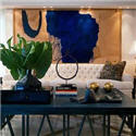
| Accents of citron and ultramarine blue pop against a neutral backdrop of beige, taupe and brown in the family room. Photo: Patricia Gray Inc. |
 |
| A soothing shade of warm taupe on the walls is a perfect backdrop for art and accessories in the den. Cushions pull a shades of brown from art by David Edwards. Photo: Patricia Gray Inc. |
 |
| The master bedroom, painted a delicate shade of pure summer sky, imbues the room with a relaxing atmosphere. A vintage Louis chair received an update with silver paint, white leather upholstery, and nail heads. Art is by Karen Lorena Parker. Photo: Patricia Gray Inc. |
 |
| Click to read the whole article Patricia Gray's Tips for Making Colour Work In Your Interior |
13.7.12
Patricia Gray Shaw TV Interview
 |
| YouTube link Patricia Gray Shaw TV Interview |
1.4.12
Let There Be Light
 Have fun with accent lighting. Finding just the right lighting is one of the most difficult things for me as an interior designer, but when it happens it is magic. I think of the room as the perfect little black dress with the perfect cut, the one that dresses up or down according to the occasion, and the perfect lighting fixture is the jewelry that finishes off and compliments the little black dress.
 I have written an article for West Coast Homes and Design, a supplement in the Vancouver Sun Newspaper,on how the right lighting is one of the most important aspects in achieving atmosphere in a home. Lighting is a discipline all to itself and often is one of the most important parts of an interior. Bad lighting can ruin a good interior: good lighting can almost salvage a bad one. For example….. (more)
In kitchens it is particularly important to get the lighting right as food preparation along with the eating and social aspects that go on in this room are a vital part of our lives and involve all of our senses. Kitchens need to be well lit with good overall ambient lighting and task lighting over islands and countertops. Add a little fun and pizazz with accent lighting as I did over this island.

Lighting in a bathroom and bedroom needs to make you feel refreshed and energetic in the morning, ready to face the challenges of the day ahead, but at night should engender a feeling of relaxation and harmony. In a bathroom, good lighting for putting on make-up should come evenly from either side of the mirror so shadows are not cast on the face. The rest of the room needs to be lit evenly from overhead, but be careful of placing recessed pot lights that are directly over your head when standing in front of a mirror or else you will have shadows under your eyes. I put the lights for the make-up lights and the overhead lights on different switches to further enhance the options to create different moods.

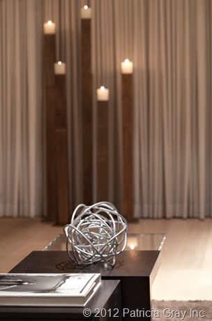
Left: Wall mounted LED swing-arm lamps were used in this bedroom for task light.
Right: Candles can add to the mood and ambience in a room and make a dramatic statement.
 Click on the PDF icon to read the whole article
WHAT'S HOT in the world of interior design, architecture, art and travel. 2012 © Patricia Gray | Interior Design Blog™
3.2.12
Highlights from Paris - My Paris Restaurants
Café Campana at the Musée d'Orsay Paris
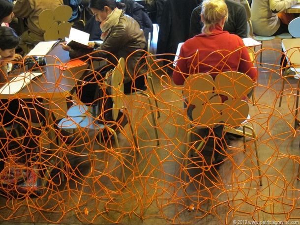
After an inspiring stroll through the new Impressionist Gallery on Level 5 of the Musée d'Orsay you arrive at the breath taking new new Pavilion Amont, the station's former engine house, and the Café Campana with futuristic décor by the Brazilian Campana Brothers. It is a provocative jumble of orange twisted coated wire fencing, sea anemone chairs by Edra, gold laser-cut lampshades resembling bells and the magnificent station clock as the focal point. This restaurant/cafe is not to be missed on a trip to Paris! Make sure that you sit facing the clock as you can actually see the hands moving and you have a beautiful view of the city of Paris. I had the most delicious salad – Comme une Niçoise with heart of cos lettuce, cherry tomato, anchovy filet, potato, tuna, hard-boiled egg and olives. See the menu here.
Cafe Flottes, 2 rue Cambon Paris
I fell in love with this Paris restaurant. It was close to my Hotel and it is on the same block as Chanel’s original store at 31 rue Cambon. Flottes serves the best home cooked French food in a casual atmosphere, and it is a favourite with the local Parisians; and rightly so. The atmosphere is bustling and friendly and the food is


simple, robust and excellent. I ate there three nights in a row and every night I had a glass of their Bordeaux wine with the special of the day followed by desert and an espresso of course. I had, respectively, the Beef bourguignon, Confit de canard, Piece de boeuf de Salers with béarnaise sauce and frites. For desert I had, two nights in a row because it was so good, tarte des demoiselles Tatin with crème fraîche - an upside down caramelized apple tart. I wish I had taken pictures of my food but I was too busy eating it. You can see the menu here. They also have a cookbook which I wanted to buy but my suitcase was already full. A nice touch to the restaurant is that Mademoiselle Flottes was bustling around the restaurant all three nights I ate there.

The seafood bar at Flottes restaurant in Paris is on the sidewalk and you can watch the seafood platters being prepared the as you walk by.

Flottes restaurant cookbook features the dishes they serve at the restaurant that have made them a favourite with the local Parisians.
Le Grand Colbert, 2 rue Vivienne Paris
On my visit to Paris I wanted to eat at Le Grand Colbert in Paris because of the history of the restaurant dating back to 1637, and the name taken from Louis XIV’s finance minister, a man well versed in cuisine, and also because my girlfriend had her wedding dinner at this restaurant….and if that is not enough, it is Le Grand Colbert restaurant is in the movie with Diane Keaton, Keanu Reeves, and Jack Nicholson – Something’s Gotta Give. Well the food was not the best I had eaten in Paris, but I ended up having a great time, as I spent the evening in conversation with the German couple sitting next to me who were in Paris for the Chanel haute couture fashion show at the Grand Palais that very day. They have been haute couture customers of Chanel’s for quite a few years and get an invitation to the show twice a year, as well as going to the famous Chanel workroom on 31 rue Cambon the day after the show to choose the pieces from the collection that will be custom made to measure for Mademoiselle. I found myself living vicariously through them; their telling me about the show, the background of haute couture, the goings on behind the scenes, etc. The show this year (I don’t know how Karl Lagerfeld does it) tops all other shows. It was set in an airplane and there were two shows back to back – one for the haute couture customers (of which there are merely 200 in the whole world) and the other show for the press. You never know who will be sitting beside you when you dine in Paris. You can download an app to your iPhone or iPad of the fashion show here. Oh, and Mademoiselle has promised to send me photos when her haute couture gowns arrive!


At Le Grand Colbert restaurant in Paris I had Belle Sole “meunière style” and for desert traditional French Crêpe Suzette flambéed with Grand Mariner.
Au 35, 35 Rue Jacob
The restaurant Au 35, was recommended to me by the concierge at my Hotel at the last minute. I asked for something simple and easy as it was my last evening in Paris. Au 35 was a 5 minute walk from my Hotel. When I walked into Au 35 I instantly felt good about the place. It was cozy and authentic, and featured delicious French food made with the freshest ingredients. The entree I had was probably one of the best seafood dishes I have ever tasted, and I mean seriously, it was superb. It was a piece of local white fish on a bed of the most delicious tasting potatoes. It is one of those dishes I will dream of at night and when I think of it, I will be transported back in time to that moment in Paris. My entree was listed on the chalkboard menu as: Filet de julienne à la pomme de terre ceraxi. For desert I had crème brûlée with salted butter fudge – yumm!

Filet de julienne à la pomme de terre ceraxi at Au 35 restaurant in Paris
Au Sauvignon, 80 Rue des Saints-Pères
This wine bar, Au Sauvignon, was recommended by the concierge at my Hotel. He says it is a place that he likes to go to with his friends for a drink before dinner of going to the theatre. It is one of he busiest and most chic spots in Paris, thanks to its location in the heart of the Left Bank, nestled among small designer boutiques and art galleries, just a stone's throw away from Au Bon Marché and across the street from Hermes’ newest store. The specialties are its tartines, or open-faced sandwiches made from pain poilâne and a single page of the compact menu and offers whites, reds and a few rosés, either by the glass or bottle.


Au Sauvignon Wine Bar Paris staircase
A steep staircase leading up to the restrooms at Au Sauvignon displays a clutter of posters celebrating the arrival of new vintages of Beaujolais, cartoon, caricatures, and paintings of Paris, including one of the bar itself. Amongst all this it’s easy to miss an inconspicuous hanging metal sign displaying the maxim “Le prix attire la clientele, la qualité seule la retient” – The price attracts the customer; only the quality brings them back.
If you have had the pleasure of eating at any of these Paris restaurants, please let me know your experience by leaving a comment here.
PATRICIA GRAY INC is an award winning interior design firm in Vancouver. Here we write about lifestyle and
WHAT'S HOT in the world of interior design, architecture, art and travel.
2012 © Patricia Gray | Interior Design Blog™
1.2.12
My Paris by Night
PATRICIA GRAY INC is an award winning interior design firm in Vancouver. Here we write about lifestyle and
WHAT'S HOT in the world of interior design, architecture, art and travel.
2012 © Patricia Gray | Interior Design Blog™
31.1.12
Parking in Paris – How do the French do it?
This is a street on the Left Bank in Paris in Saint-Germain-des-Prés. It is not unlike parking on other streets in Paris. I was continually amazed at how the French managed to park their cars so close together and then how they managed to get out of such a tight spot. Surprisingly I didn’t see a lot of damaged bumpers.

Parking in Paris – how do the French do it?
PATRICIA GRAY INC is an award winning interior design firm in Vancouver. Here we write about lifestyle and
WHAT'S HOT in the world of interior design, architecture, art and travel.
2012 © Patricia Gray | Interior Design Blog™
30.1.12
Highlights from Paris - Maison et Objet 2012
I have just returned from Paris where I attended Maison et Objet. Maison et Objet is Europe's biggest décor show where I got the first look at the products, colours, and styles that will set the trends for the world for 2012 in interior design.
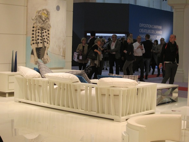

The Spanish furniture Company Baltus regards the creation of a piece of furniture as a work of art. They create avant-garde pieces with simple geometric shapes in amazing lacquer finishes. Maison et Objet 2012

A new line of bedding from Diane von Furstenberg. Maison et Objet 2012
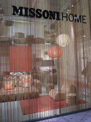
Missioni - bright, colourful, and fun! Maison et Objet 2012
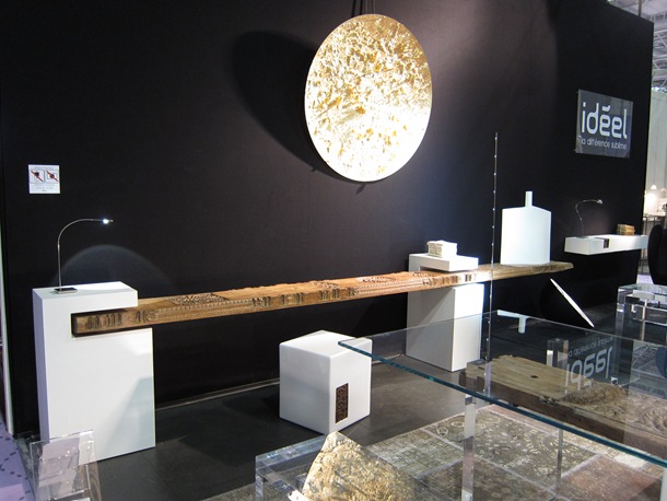
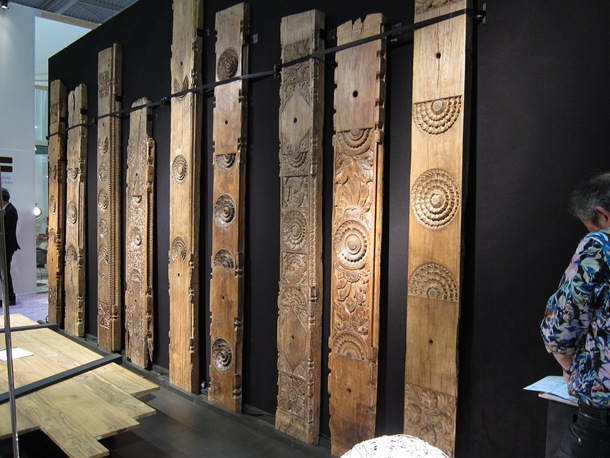
Ideel Contemporary Furniture incorporates salvaged antique teak ceiling beams and posts from Indian architecture into unique furniture pieces. Maison et Objet 2012
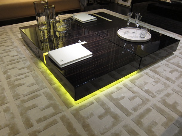

A TV incorporated into a mirror in the Fendi showroom. Maison et Objet 2012

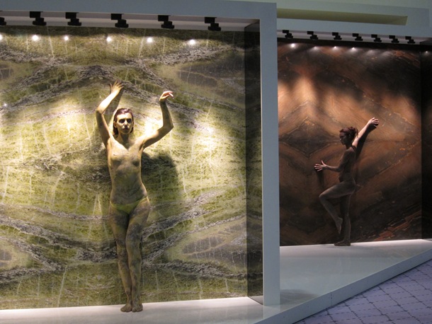
A show stopping display by the Italian stone company, Antolini Luigi. The models were painted to blend into the slabs of granite and marble. Very evocative and very Italian! Maison et Objet 2012


Lighting by the German Company Anthologie Quartett. Maison et Objet 2012

I wish Kitchen Aid would offer sleek products like this for the North American market. Maison et Objet 2012


Designed by the French designer David Turpin this contemporary styled Bluetooth handset has an integrated iPhone charging dock. Check out their web-site as they have some very innovative products. Native Union Maison et Objet 2012

From Tokyo porcelain cups by Ken Noborumurata. Maison et Objet 2012
PATRICIA GRAY INC is an award winning interior design firm in Vancouver. Here we write about lifestyle and
WHAT'S HOT in the world of interior design, architecture, art and travel.
2012 © Patricia Gray | Interior Design Blog™


